Three Happiness
Responsive Design
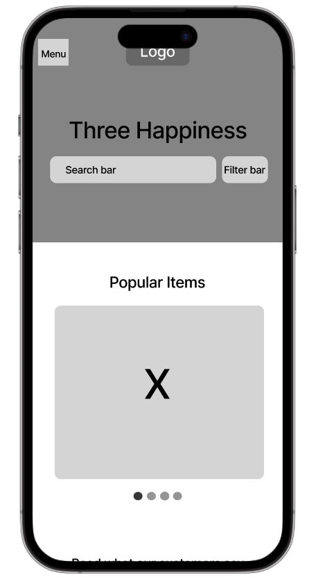
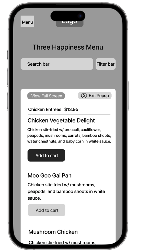
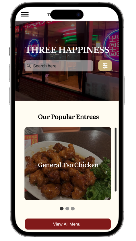
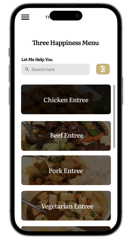
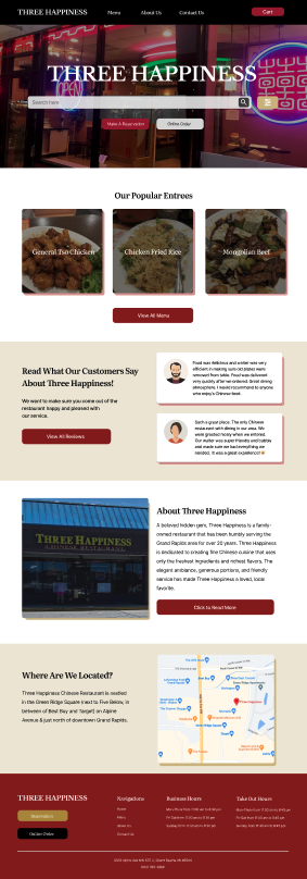
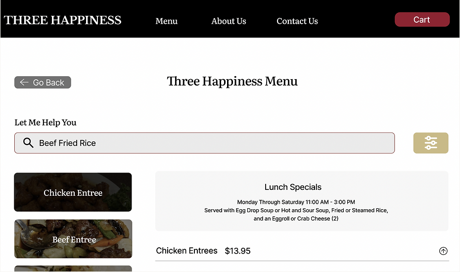
Three Happiness is a Chinese-American restaurant. Users are able to see all of their information at once through the search and filter bar. These features make it easy for users to navigate through the menu and there is also a possibility of including a microphone function that allows user to speak instead of typing out what they want to find.
Overview
Challenge
How might we help individuals who are overwhelmed when browsing the restaurant’s menu?
Role: UX/UI Designer and UX Research
Contract: 2 years
Duration: 4 weeks
Solution
Design a straightforward website with a simplified menu to enhance the customer experience and reduce overwhelm.
Tools
Figma
Photoshop
Google Analytics
Discover
Research
We want to know what users are looking forward to when they click on the website. Meaning, what user-friendly features are helpful for them
I might find people who want to learn more about the business values.
I might find people who are already struggling to order food online.
Assumptions
Methodologies
Secondary Research: Learn more about the competitors (find three restaurants)
• User interviews: Hear their stories and experiences when browsing a food website
• Contextual interviews
Participants:
People who live in Michigan.
People aging from 18 and up.
Competitive Analysis
During this phase of the project, my primary focus was on extensively exploring different restaurant websites, and conducting a comprehensive analysis of their key features and the challenges they face. To better understand the restaurant market, I conducted research on three noteworthy companies that offer easy-to-read menus, pictures, and able-to-change ingredients. I focused on the site’s key features, brand identity, and aesthetics to pin point on what Three Happiness can improve.
Strengths
Reward system
Developing a well order-tracking system
Visually appealing
Weaknesses
Need improvements on being able to provide users with accessibility
Making their website less distracting (too many moving pictures and moving icons)
Strengths
Celebrate the cultures that inspire individuals by using real ingredients in their recipes
User-friendly platform
Weaknesses
Not being able to show the main ingredients of their food items
Technical difficulties when navigating the website
Strengths
Having pictures of their food items that are visually appealing to the users
Having online orders, reward points, catering, and merch
Weaknesses
The website is too cluttered and can be overwhelming
Less amount of white space
Key Findings
It was determined that the home screen and the menu were the most important screens that would leave an impression on the users.
Adding pictures of each food item is important for the users.
Having a good amount of white space throughout the website makes it less overwhelming.
User Interviews
During the interviews conducted, participants expressed their desire for a fast and user-friendly browsing experience when searching for restaurants, highlighting their proactive approach toward finding enjoyable dining experiences.
Throughout the interviews, four common pain points emerged in the context of restaurant browsing:
Time-consuming: Participants reported that it takes them a long time to find a specific item that they wanted.
Accessibility and availability: Some participants expressed concerns about the accessibility and availability of restaurants in their area, particularly for individuals living in remote or underserved locations.
Misinformation: Participants expressed their frustrations about not knowing when the restaurants open or close, and when an entree is sold out.
They want?
Users want a fast and easy browsing process.
Users want to be able to find certain entrees without having to read through the whole menu.
Users want an easy online ordering process.
Key Findings
Main Themes
Lack of not knowing where to find a specific entree.
Time-consuming
Not knowing how to navigate through the website
Define
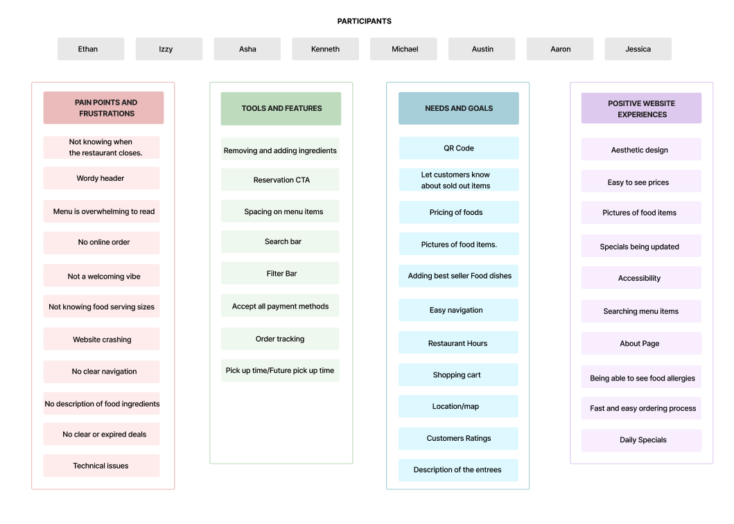
Affinity Map
After conducting insightful user interviews, the next step in my project was to develop a categorized map to determine the areas I should prioritize. This map allowed me to organize the information gathered from the interviews and identify key themes and patterns that emerged.
By utilizing this categorized map as a foundation, I could confidently move forward in my project, aligning my efforts with the identified priorities and working towards delivering a solution that best addressed the needs and aspirations of the users.
Common Themes:
Positive website experiences: Users enjoy websites that are welcoming.
Needs and goals: Users seek fast and easy navigation when browsing a website.
Tools and features: Users appreciate it when websites inform them about the availability of food items and provide pictures of each item.
Pain points and frustrations: Users have expressed their frustration when the restaurant's opening and closing hours are incorrect and when they order food that is subsequently found to be sold out.
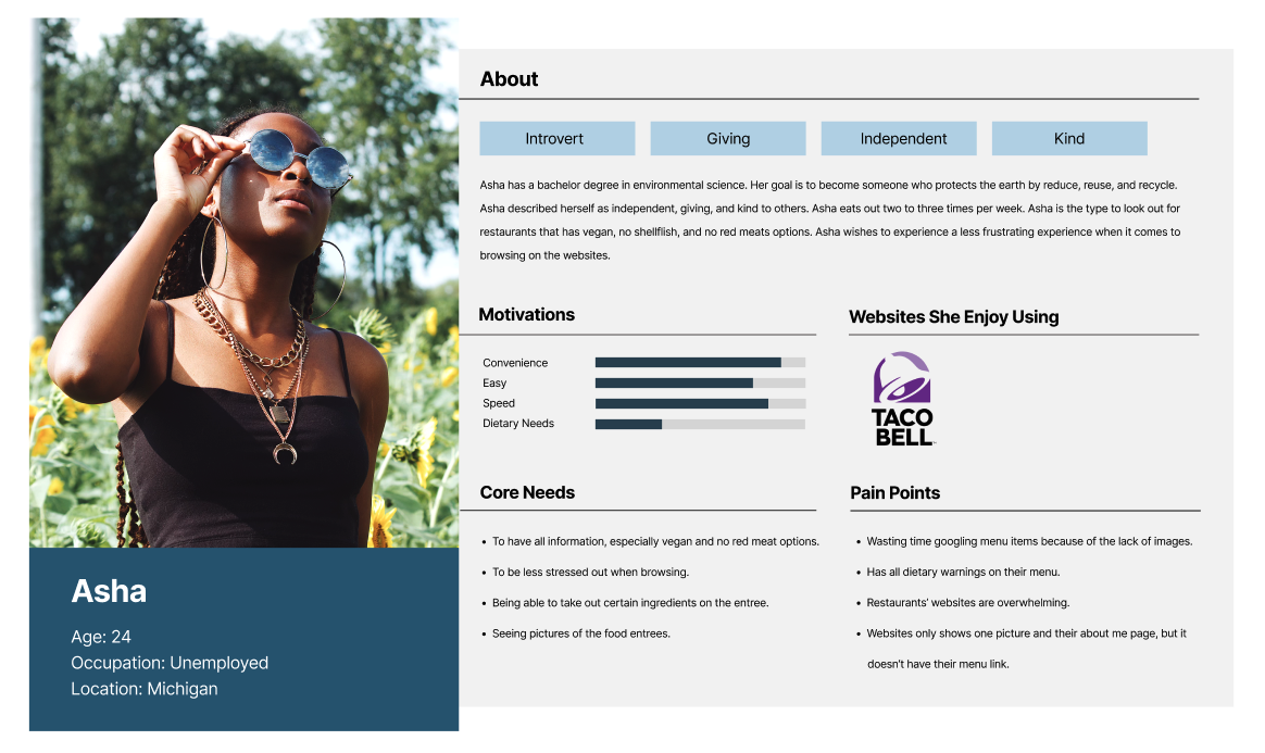
User Personas
In crafting my user personas, I aimed to encompass a diverse range of perspectives, which led me to select two distinct individuals, Kenneth and Asha, as the representative participants. This choice was rooted in the wealth of information I had gathered, allowing me to create personas that reflect varying needs, preferences, and behaviors. Kenneth and Asha each bring unique insights and experiences to the table, enriching the depth and better of our understanding of user interactions and expectations.
Why did I choose them?
Kenneth focuses on accessibility and an easy navigation process.
Asha focuses on finding an entree that is vegan and has ingredient information.
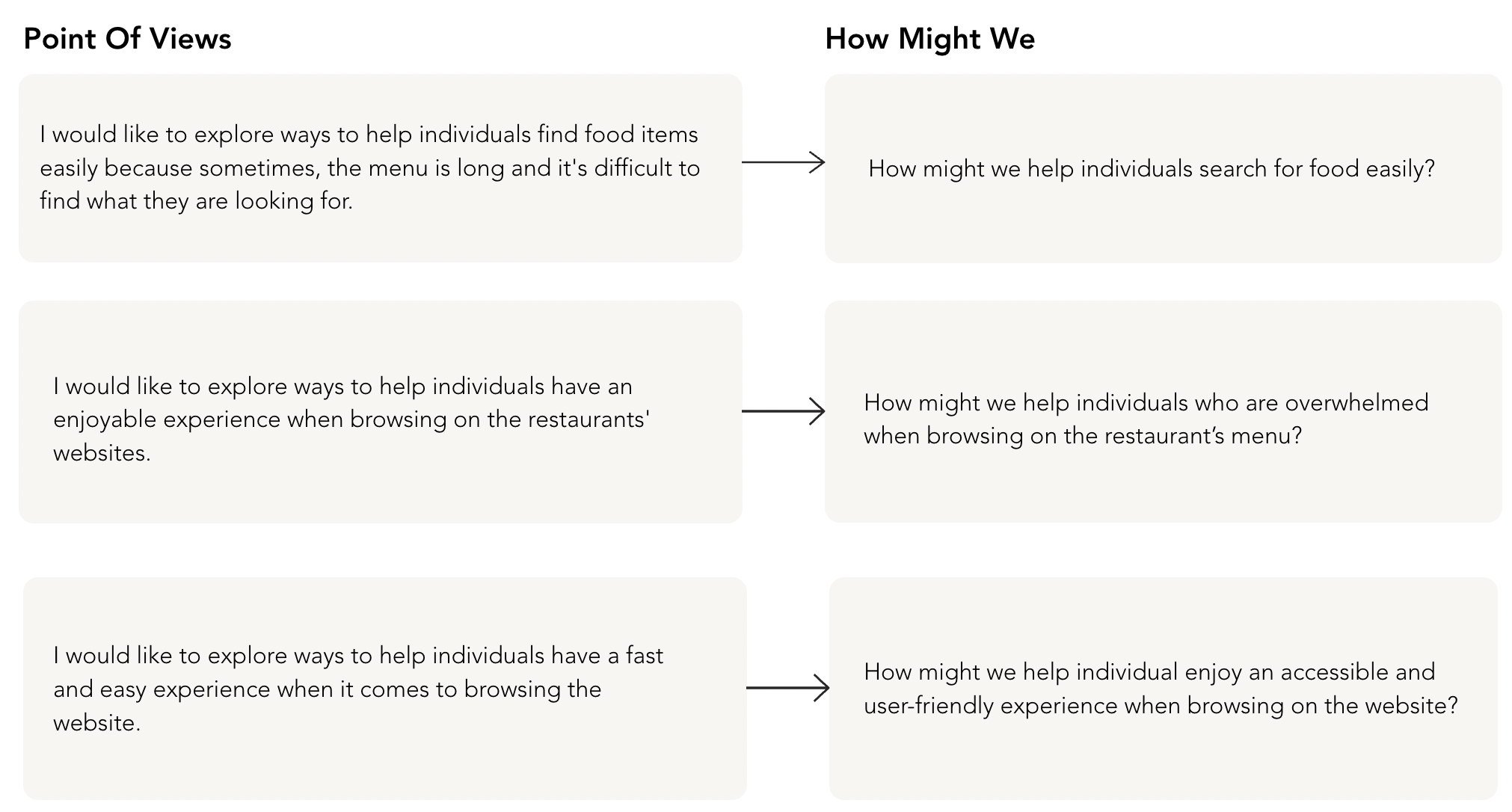
POV and HMW
After talking to my users and creating my affinity map, I developed POV statements that helps frame the users’ problems and needs. After creating the POVs, I came up with HMWs to guide me through the design process to develop innovative solutions to my design.
Develop
Roadmap
After researching various restaurant companies, I figured out what attracts the customers and what doesn’t. Therefore, I created the roadmap to determine my next step.
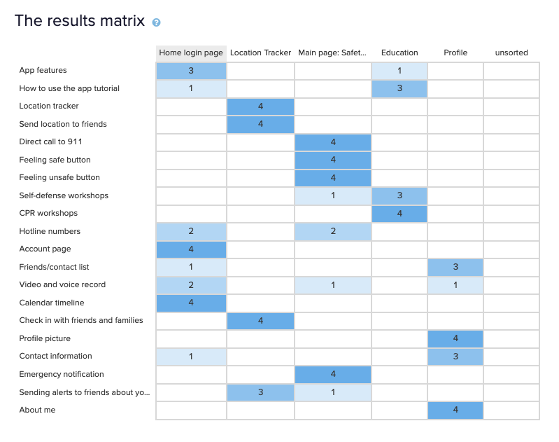
Card Sorting
To better understand the user's preferences and prioritize key features within the app, I conducted a card sorting activity. This activity aimed to elicit valuable insights on which features should be given priority when users interact with the app.
To gather a diverse range of perspectives, I carefully selected six participants who represented different demographics, backgrounds, and usage patterns. This approach ensured a well-rounded understanding of the user base and accounted for various user preferences and needs.
Method: Optimal Workshop.
Participants: Some of the participants were from the interview and the others were not from the group of participants that I interviewed.
Results
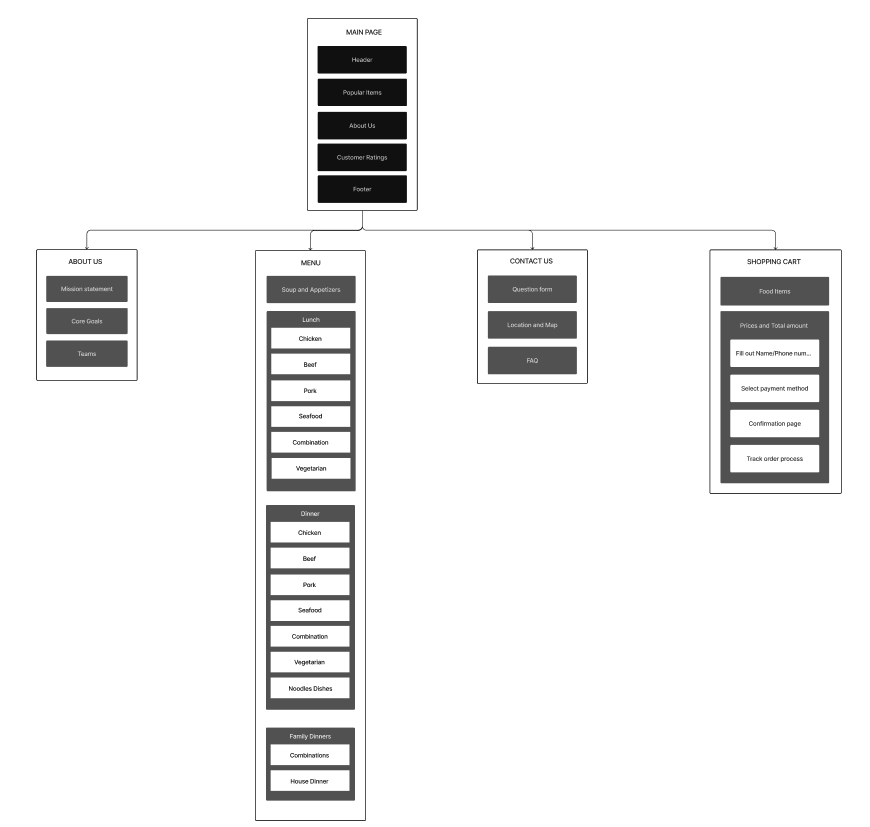
Sitemap
To establish a solid foundation for my design, I created a comprehensive site map that served as a blueprint for the website's structure and organization. The site map was an essential tool in visualizing and determining the foundational layout of the design.
By developing the site map, I aimed to establish a logical and intuitive navigation flow, ensuring that users could easily find the information they needed and navigate through the website seamlessly.
Low-Fidelity Wireframes
Before delving into the wireframing stage, I focused on two key aspects: accessibility and positive user experience. By placing these aspects at the forefront, I laid a solid foundation that would guide the subsequent development of high-fidelity wireframes.
By considering accessibility, positive user experience, and modern visual aesthetics throughout the wireframing process, I aimed to deliver a design that not only captivates users but also seamlessly guides them through their interactions, resulting in a delightful and engaging experience.
Mobile Wireframes
Desktop Wireframes
Viewing Website on Mobile Wireframes
UI Kits and Brand Identity
From a visual standpoint, the website features a clean and modern design with a white background, red accents, and high-quality images showcasing various dishes.
What does Three Happiness entail?
Authenticity: The website conveys a sense of authenticity, suggesting that the restaurant values genuine and traditional flavors.
Variety: The website highlights a diverse menu featuring a range of Chinese and Szechuan dishes. This suggests that the restaurant values offering a wide selection of options to cater to different preferences and dietary needs.
Customer satisfaction: The website includes customer reviews and ratings, indicating a focus on providing a satisfying dining experience.
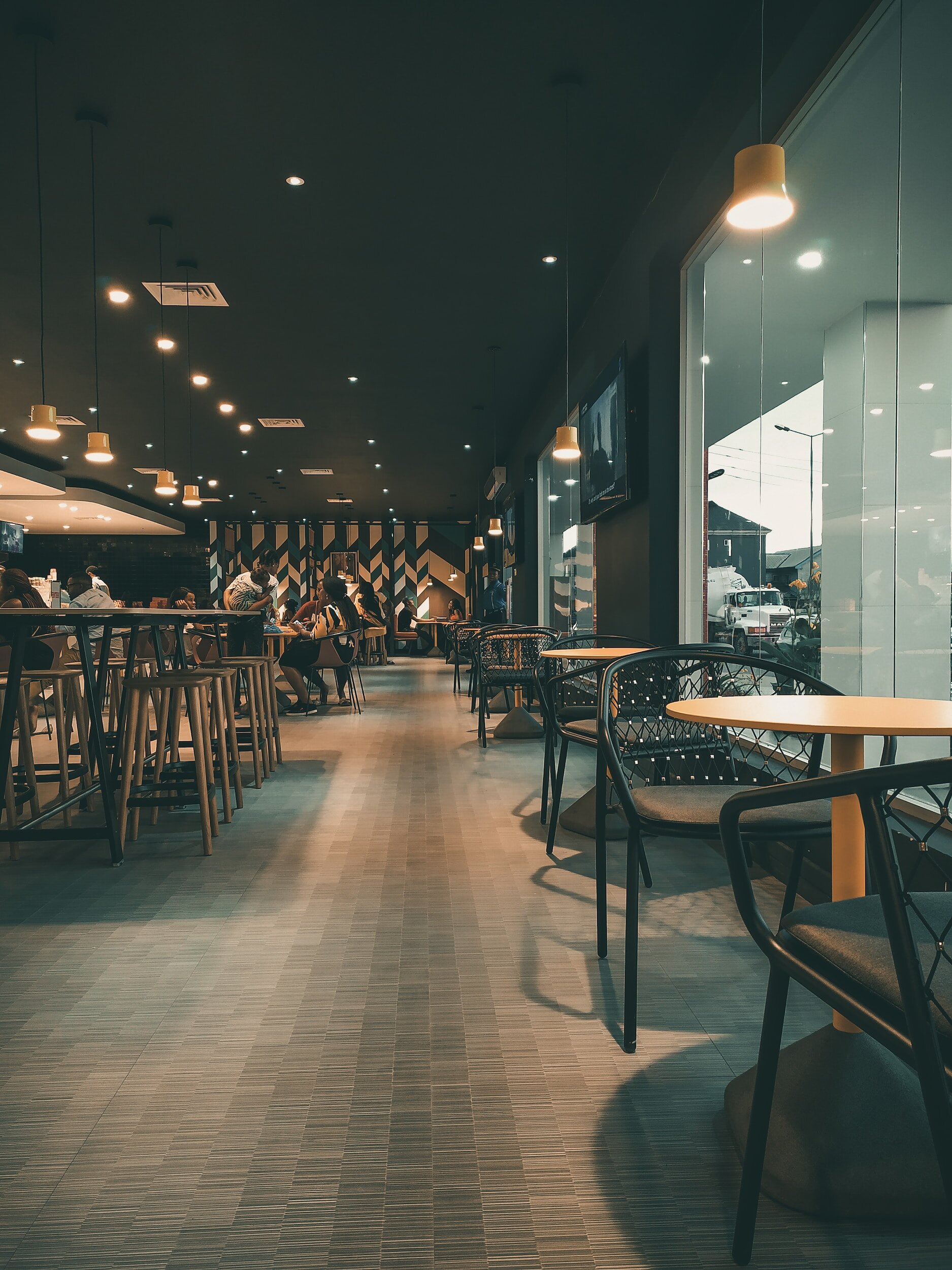
Warm and inviting atmosphere: While not explicitly stated on the website, the images of the restaurant's interior and the overall design aesthetics convey a warm and inviting ambiance. This suggests that the brand values creating a welcoming environment for diners.
After speaking to the Three Happiness owners, they want to incorporate using red and yellow based on their Chinese culture. We found that using these colors will promote culture and welcoming vibes to users when navigating through the website.
Color Palettes
Logo
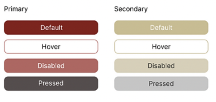
Buttons
Icons
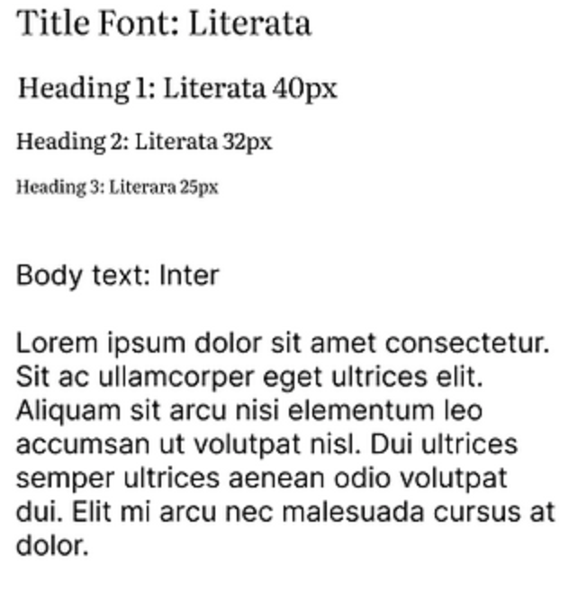
Typography
High-Fidelity Wireframes
Throughout the design process, I placed significant emphasis on addressing key challenges to elevate the overall user experience. These challenges encompassed:
Ensuring consistency: Consistency is important in my design approach. I maintained a cohesive visual language, coherent typography, and consistent interactions throughout the entire product. This commitment to consistency promotes familiarity and instills confidence in users as they navigate different sections of the design.
Avoiding overwhelming users: I intentionally imbued the design with elements that foster a sense of calmness and tranquility. By carefully selecting colors, typography, and imagery, I aimed to create an environment where users feel at ease during their interactions with the product.
To further refine the usability of the design, I have planned comprehensive usability testing. This important phase will allow me to gather invaluable user feedback and insights. By observing how users interact with the design, I will identify potential areas of improvement and implement necessary refinements to optimize the user experience.
Through this iterative process, I am committed to crafting a design that not only captivates users visually but also delivers a seamless and delightful user experience. By listening to and incorporating user feedback, I aim to create a design that truly meets the needs and desires of its intended audience.
Desktop Wireframes
Viewing Website on Mobile Wireframes
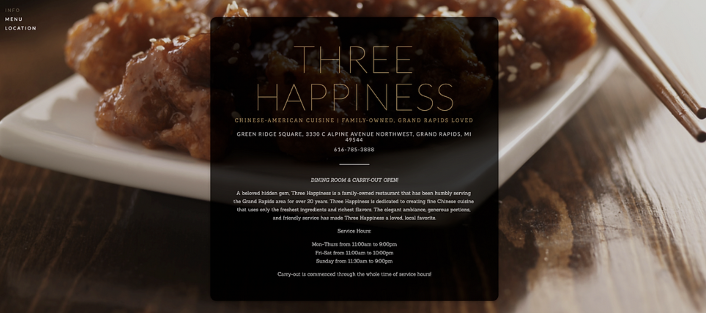
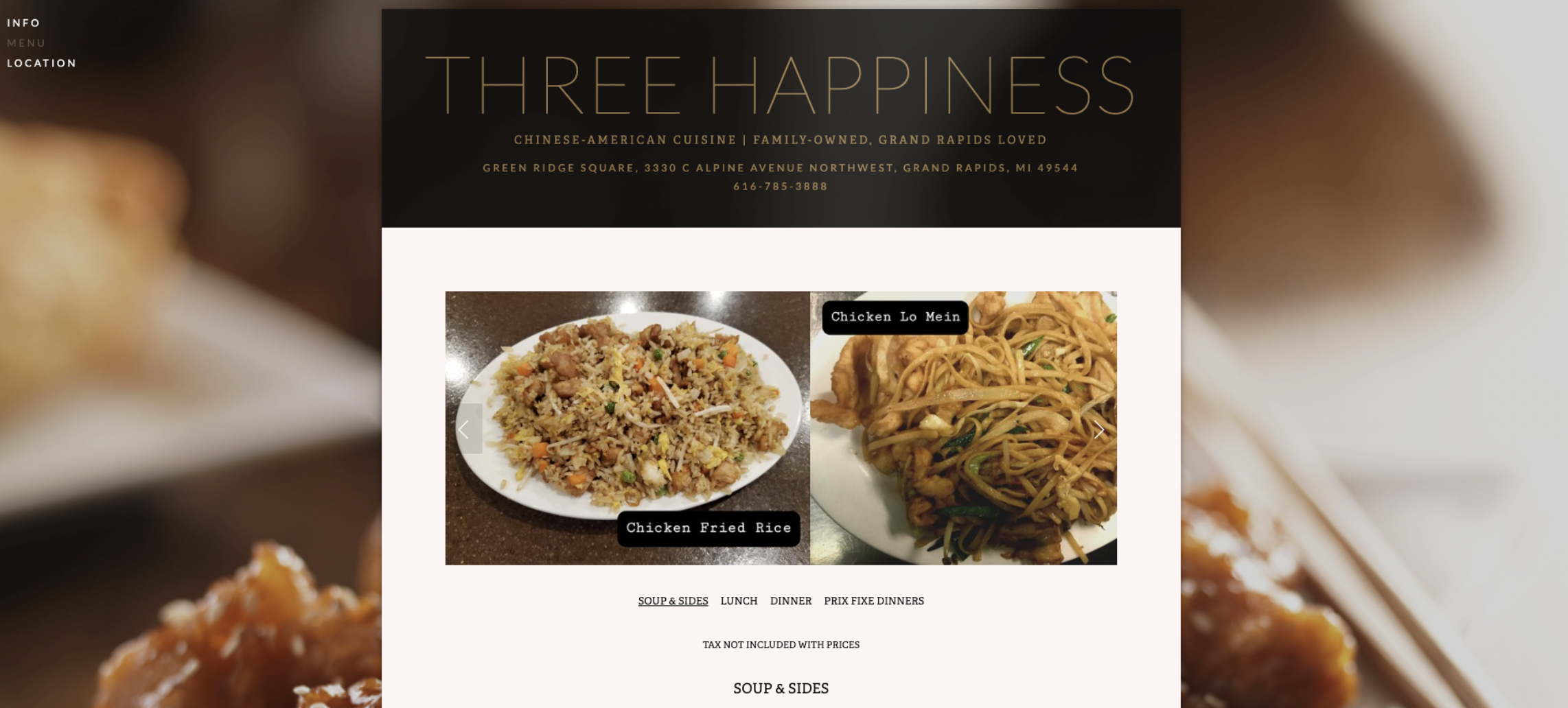
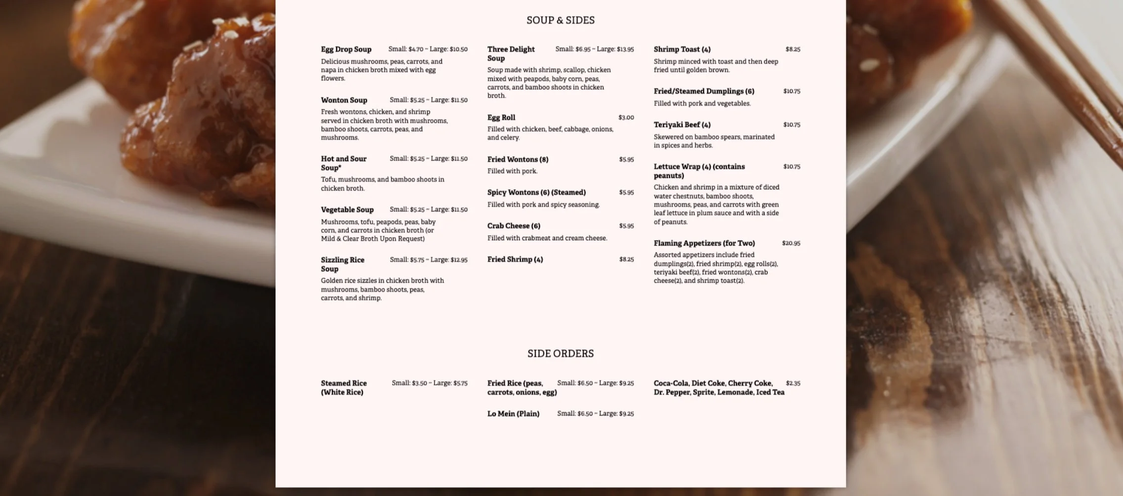
Their Old Layout
Test and Iterate
Usability Testing
User Tasks:
First task: to the first task. To make it easier, I will give them a scenario. I want to order Chicken Delight Entree without mushrooms. Can you please go through the prototype to order the entree?
Second task: I want to learn more about Three Happiness’ brand value and their mission statement. Can you please go through the prototype to find their about us page?
Third Task: I need help finding the Beef Fried Rice entree. Can you show me how to search for it?
Fourth Task: I have trouble adding and removing ingredients. Would you please go through the prototype to remove mushrooms in the chicken delight entree?
Feedback:
5 out of 5 participants have experienced the same process while navigating through all tasks.
All participants said it was easy to navigate now that it was fixed. Overall, some users felt that it was easy to navigate through all the tasks.
Other users felt that it was difficult to navigate through the tasks because they didn’t know what to click to find workshops and mental health information.
One user suggested adding those items to the homepage.
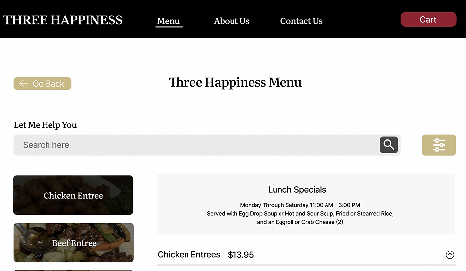
Before
Add underline to let user know what page they are on.
After
Final Prototype
What worked and what didn’t?
After conducting user interviews and usability testing, users informed me that it’s a good idea to let the customers know when food items are sold out, open and closed restaurant hours, and pictures of each food item.
Reflection
Working on this app has been an incredibly meaningful journey for me, fueling my passion for creating exceptional user experiences while providing invaluable learning opportunities. My primary objective was to optimize the design elements that deeply resonate with users and have a profound impact on their overall experience.
Throughout this project, I have gained valuable insights that have influenced my design approach:
Emphasizing research and ideation: I have realized the significance of generating innovative feature ideas and conducting thorough research and interviews specifically tailored to mental health resources. Going forward, I am determined to formulate more refined research questions that will yield superior outcomes.
Continuous user testing and iteration: I understand that user testing is an ongoing process that extends beyond development. Designs evolve over time, and it is essential to iterate and refine them based on user feedback and changing needs.
Based on my reflections, I have identified specific changes that I aim to implement:
Expanding the scope of interviews: I intend to broaden my interview pool to include a diverse range of individuals, ensuring a more comprehensive understanding of user perspectives and requirements.
Expanding network: I had trouble finding participants to interview and usability testing. I learned to reach out on social media platforms such as LinkedIn, Instagram, and UX/UI Design Facebook groups.
By leveraging these insights, my ultimate goal is to deliver impactful designs that seamlessly align with users' needs, enriching their overall experience.


