Spotify
Add A Feature
Users can stream a wide variety of music tracks and albums from different genres. Spotify offers a vast music library, including songs from major record labels and independent artists.
Overview
Role: UX/UI Design. Timeframe: 2 weeks
Background
Spotify's "Add to Playlist" feature has been generally user-friendly, allowing listeners to curate and organize their music seamlessly. However, some users have occasionally found the process to be a bit tedious and time-consuming, particularly when attempting to add multiple tracks to specific playlists. Navigating through the app's interface to find the desired playlist and then individually adding each track can be perceived as cumbersome for those seeking a more efficient experience.
Challenge
How can we improve the overall efficiency of the "Add to Playlist" feature, making it more user-friendly for individuals who regularly update and manage their playlists?
Solution
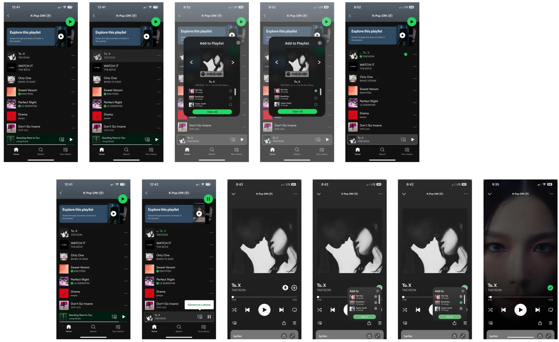
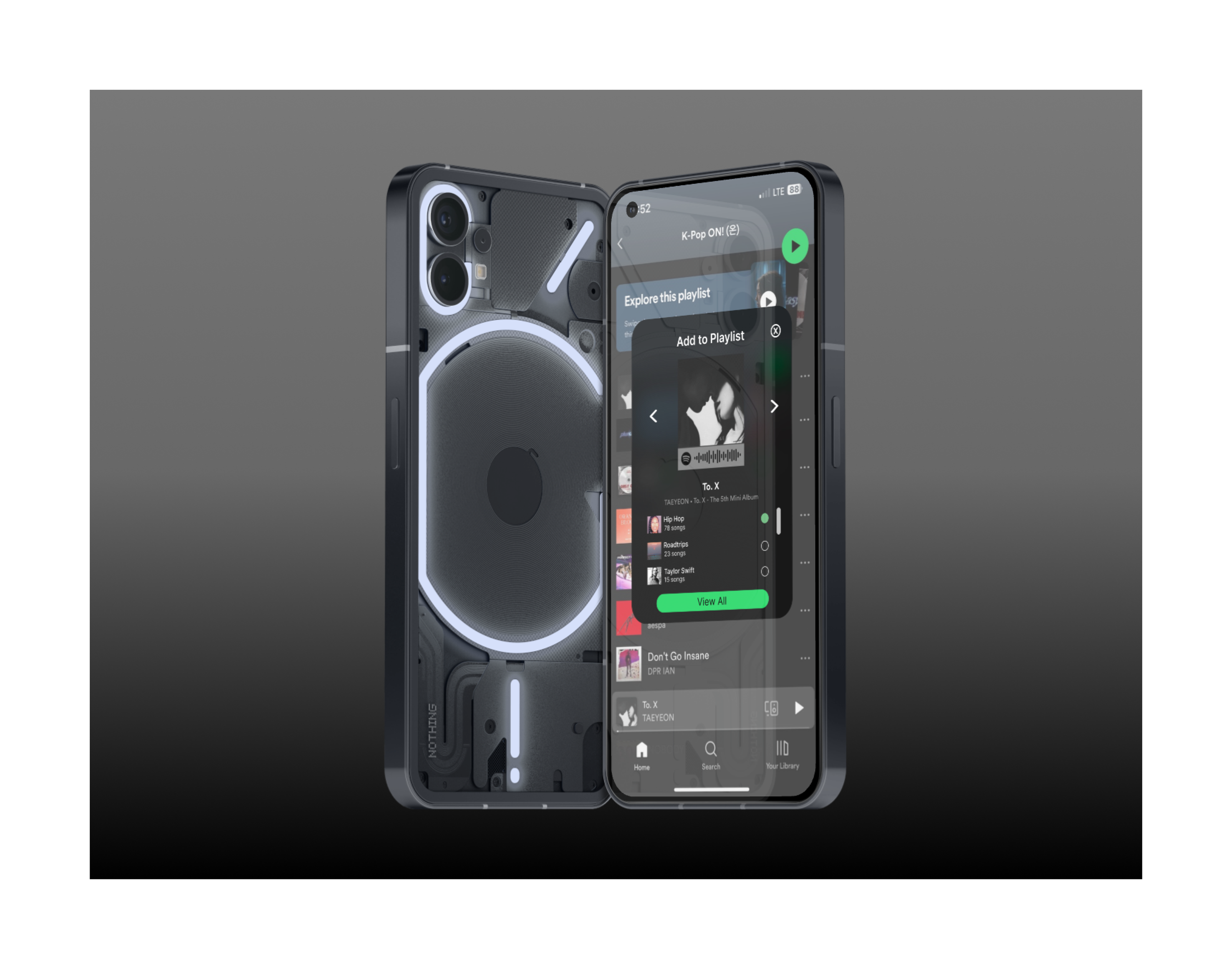
Create a quick add to playlist popup and long-press feature
My designing Process
Discover
Research
This foundational phase is pivotal in sculpting the course of my decision-making journey within the sphere of Spotify's user experience. Through diligent research, I've gathered information that will lay the groundwork for my design approach. What captured my attention during my research were:
Competitive Analysis
When conducting a competitive analysis research on Apple Music, Pandora, and YouTube Music, you may want to consider various aspects to gain a comprehensive understanding of their strengths, weaknesses, opportunities, and threats. I systematically examined the applications of each competitor on a mobile platform as part of my comprehensive competitive analysis. Through this process, I discerned the strengths and weaknesses inherent in each app, enabling me to pinpoint potential opportunities. This analysis not only facilitated the identification of strategic differentiators for Spotify, particularly in the realm of the new social feature, but also shed light on unexplored avenues where Spotify could set itself apart through social features.
Here are some additional points you might want to explore for each platform:
Insights:
The learning experience for individuals using Apple Music, Pandora, and YouTube Music varies based on personal preferences, needs, and usage patterns.
Three companies share a common objective:
Simple and Accessible
Offline Listening
User-Generated Content Exploration
User Interviews
Following a series of enlightening user interviews, I gained valuable insights into the myriad challenges and frustrations that individuals encounter when navigating the intricacies of safety apps. These candid conversations provided a tapestry of user experiences, which in turn allowed me to identify and emphasize the recurring pain points that users face in this context.
Summary
Users reported that sometimes they accidentally swipe left or right on a song.
Users expressed their frustration about unnecessary steps when adding a song to their personalized playlist.
Key Insight From Interviews
Problem
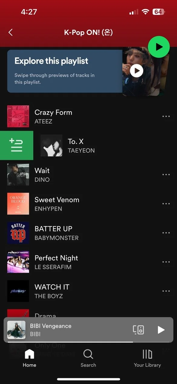
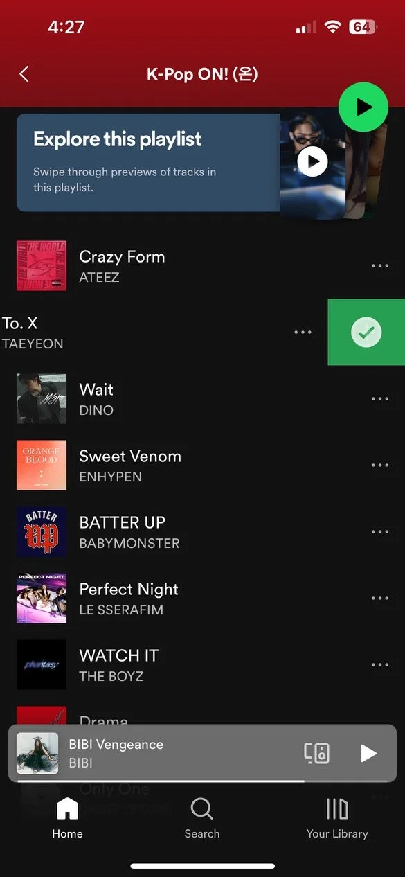
Problem 1: Accidental Swiping
In Spotify's user interface, a common occurrence involves users inadvertently swiping left or right, triggering unintended actions. This accidental swiping phenomenon adds an element of unpredictability to the user experience, potentially leading to the unintentional skipping of tracks or navigating to different sections of the app. The tactile nature of swiping gestures, while intuitive for intentional actions, occasionally poses a challenge when users simply intend to scroll or explore content.
Swiping right
On a Spotify’s playlist
Solution
Solution 1: Long Press
People often prefer using the long-press features in interfaces due to its intuitive and deliberate nature, providing a sense of control and intentionality. Long-pressing, which involves holding down on an element for an extended duration, typically activates additional options. This method is favored for several reasons. Firstly, it reduces the likelihood of accidental activations, as it requires a deliberate and sustained touch.
Swiping left
Problem
Problem 2: Extra Unnecessary Steps
Users often find long and unnecessary steps in the process of adding a song to their personalized playlist to be cumbersome and frustrating. The essence of personalizing a playlist is to make the experience quick, enjoyable, and tailored to individual preferences. When confronted with a convoluted process that involves excessive clicks, navigation, or confirmation steps, users feel a sense of inconvenience and diminished user-friendliness.
Solution
Problem 2: Pop-up
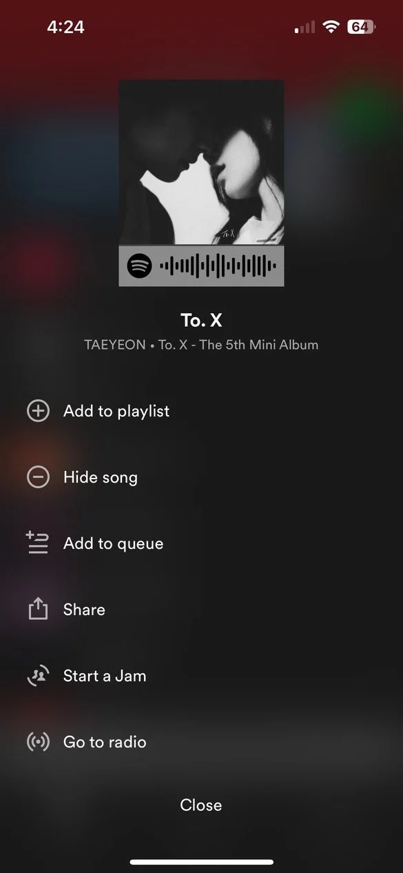
Pop-up features provide a focused and concise interface that appears in response to specific user actions, reducing the need for extensive navigation. When adding a song to a playlist or exploring additional options, a well-designed pop-up minimizes disruptions to the main screen, maintaining the user's current context. This approach is appreciated because it allows users to perform tasks efficiently without being redirected to a separate page, enhancing overall usability and saving time.
When you clicked the three bubble
Add to the playlist button
Define
User Personas
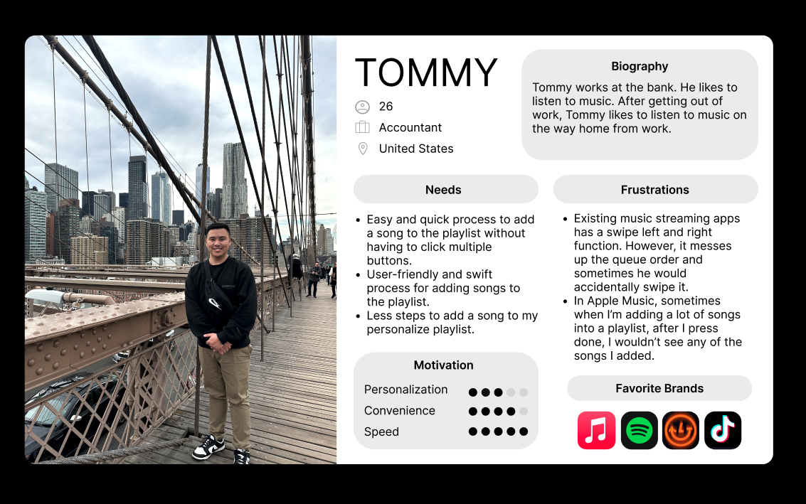
In crafting a user persona, I aimed to encompass a diverse range of individuals. I achieved this by synthesizing insights from user surveys and interviews to build my empathy.
Storyboard Development
I crafted a comprehensive storyboard centered around the user's interaction with Spotify, meticulously examining various scenarios that users encounter while engaging with the product. Through this process, I discerned potential impediments within the user experience, enabling me to strategically determine the subsequent course of action.
Develop
Information Architecture
Spotify App Map
Within this site map, I implemented new features onto the existing sitemap. It's crucial to consider how these additions enhance the overall user experience and contribute to the site's objectives. By providing a comprehensive overview of the new features implemented within the existing sitemap, you communicate not only what has changed but also how these changes positively impact the user experience and overall site objectives.
Interaction Design
Task Flow
My goal was to craft a visual roadmap illustrating the sequential steps essential for the app's functionality. By utilizing the task flow structure, I sought to deepen my understanding of the optimal ways to streamline and expedite processes within the product, emphasizing efficiency and speed as key objectives.
Scenarios
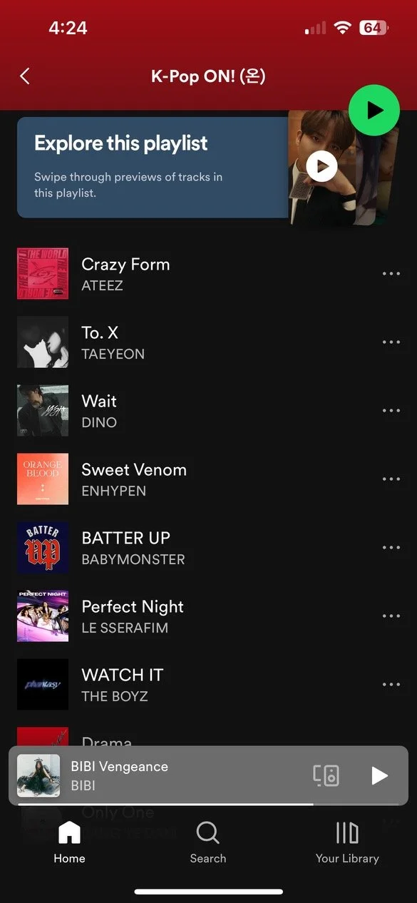
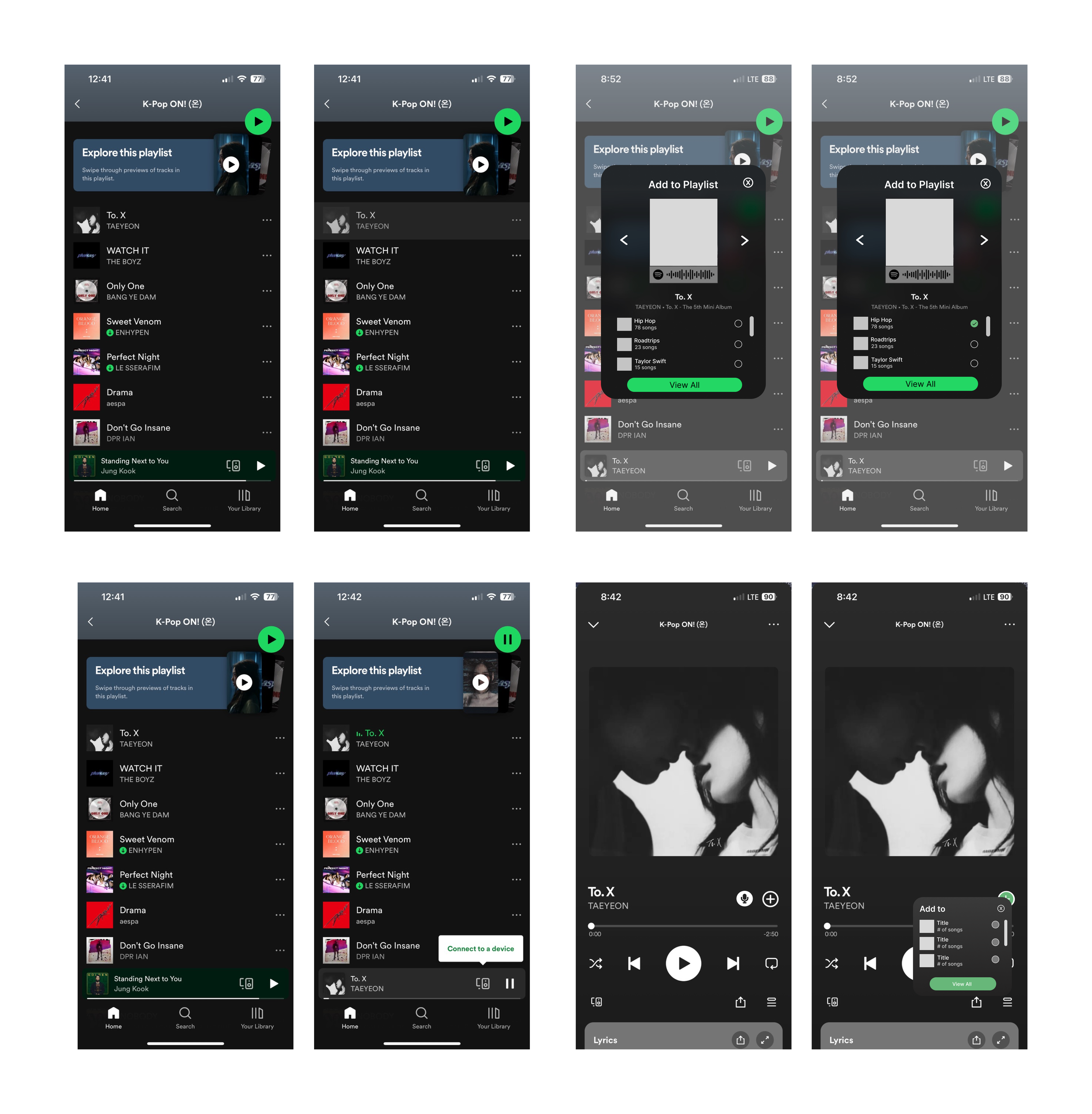
First task: Suzy would like to add the song, To.X by Taeyeon to her personal playlist from the K-pop ON! playlist.
Second task: Suzy is on the now playing screen and would like to add the song, To. X by Taeyeon to her ‘Roadtrip’ playlist.
User Flow
I aimed to create a visual representation of the steps involved in completing this product. Utilizing the task flow structure enabled me to enhance the speed and effectiveness of this feature.
Sketches
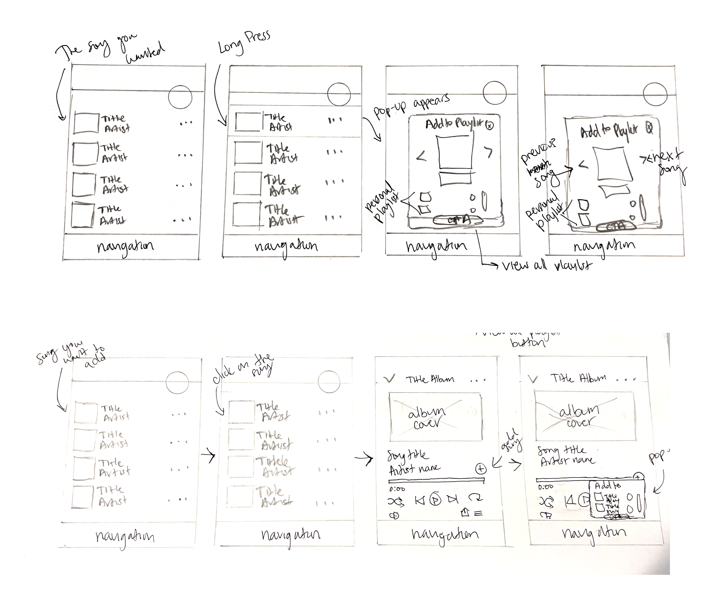
Utilizing the insights gleaned from the user journey and storyboard, I envisioned on the process of sketching and crafting wireframes to bring the envisioned task to life. A key component of the strategy focused on infusing the new feature with captivating elements. I incorporated gamification principles, introducing rewards and badges to enhance the functionality and make the user experience more engaging and rewarding.
Mid-Fidelity Wireframes
UI Kits and Brand Identity
This is Spotify's existing UI designs and brand identity. The UI kit encompasses typographic hierarchy, button formats, sizes, states, and variants, along with detailed guidelines on grid structures. Additionally, I defined a systematic approach for iconography, drawing inspiration from Spotify's intuitive and recognizable icon design principles. This cohesive integration of design elements aims to not only provide a reassuring experience but also align with the visual language established by Spotify's successful brand identity.
High-Fidelity Wireframes
Engaging in user testing proved instrumental in evaluating the identified key user tasks discovered during the research phase. Upon subjecting the finalized user interface to scrutiny, it became apparent that while the tasks were generally straightforward, specific elements warranted a reevaluation. Additionally, the incorporation of Spotify's long-press and pop-up features added an extra layer of interaction and responsiveness, providing users with a more intuitive and seamless experience.
Mock-ups
Deliver
Prototype Testing
I conducted the high-fidelity prototype, which later underwent the usability testing with a diverse group of four participants, enabling us to gather invaluable feedback and refine the product.
Tasks:
First task: I found a recommended playlist on Spotify. I really like the song To. X by Taeyeon. Can you please show me how to add it to my playlist?
Second task: I’m on the playing now screen and wondering how I can add To. X by Taeyeon to my Roadtrip playlist. Can you show me how?
I measured success with:
Is the process easy and quick to complete the user flow?
Would the user understand how the features work?
How easy is it to navigate the user flow?
Key Insights
Iterations
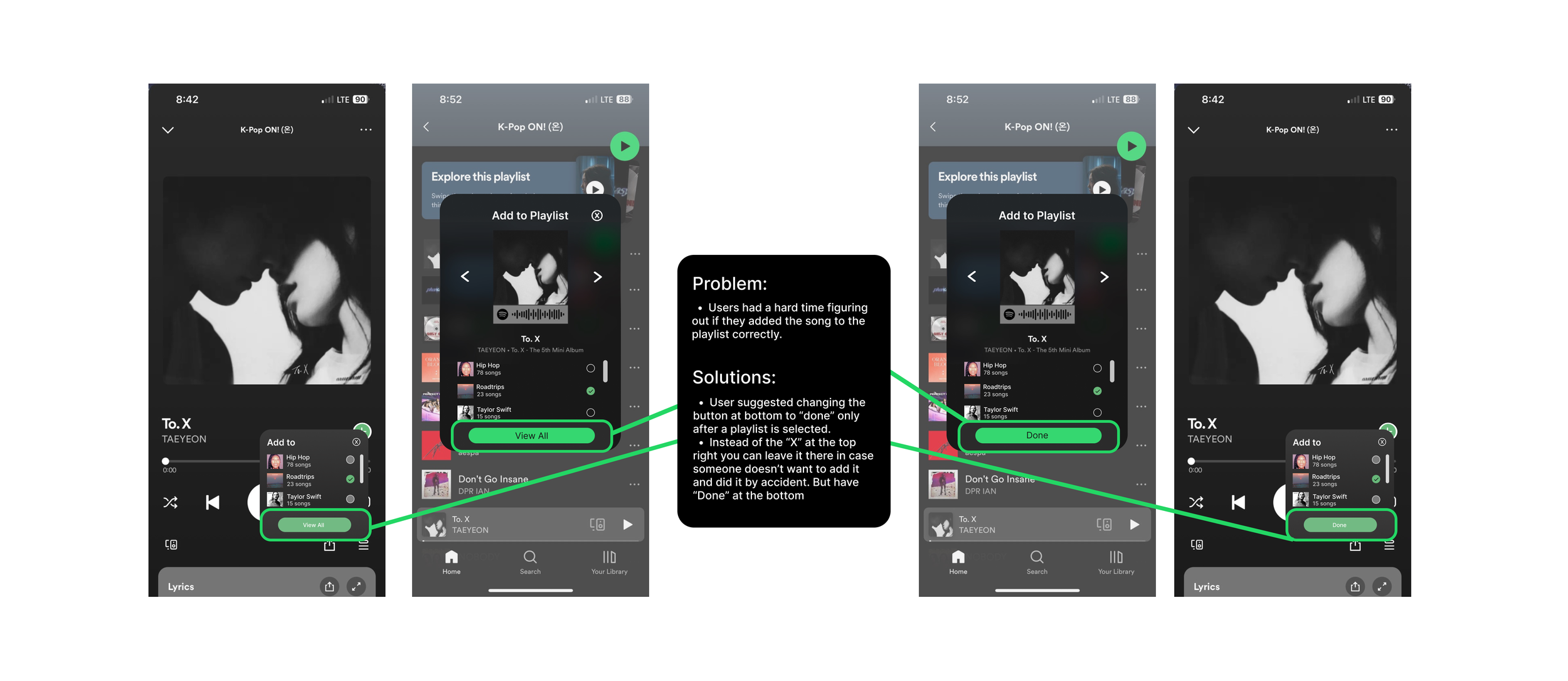
After receiving feedbacks, I was able to make those changes on my designs.
Before
After
Final Prototype
What worked and what didn't work?
Once users' feedback was gathered, I was able to implement their suggestions on how to improve user experiences.
Lesson learned:
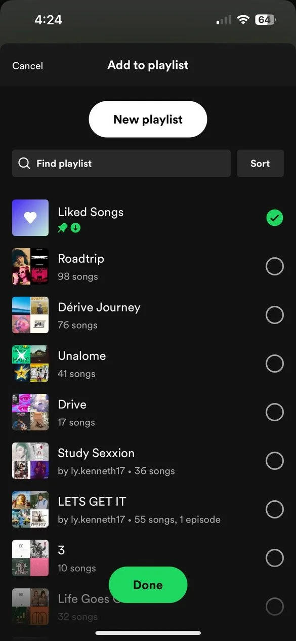
Some individuals might not know if the songs are added to the playlist. Therefore, when a user selects a playlist to which they want to add a song, there should be a 'Done' button that lets users know.
Reflection
First, I am proud of myself for adding this feature. I was very excited to show my participant my design. After completing this project, I have learned a great deal. Not only did I enhance my technical skills in implementing new features, but I also gained valuable experience in user interaction and feedback. Presenting my design to the participant allowed me to understand the real-world implications of my work and improve the user experience further. Additionally, the process taught me the importance of user-centered design and the need to consider the perspectives and expectations of the end-users. Overall, this project has been a rewarding journey that has contributed significantly to my growth as a designer/developer.
I have learned:
To make the process a step-by-step for the users to understand how to use this feature.
Some users don’t have time to follow unnecessary steps. Therefore, making it as simple as possible will make the users happy.
Next steps
I would like to conduct more tests to make sure the product works and conduct user interviews. By conducting more usability testings and interviews, the design will be handed off to a developer.


