Starbucks
Adding A Feature
Starbucks is a renowned coffee company that offers a wide range of coffee, tea, and pastries. Individuals are able to customize their drinks. However, what about adding a group ordering feature to lessen individual stress when it comes to ordering for everyone?
Overview
Challenge
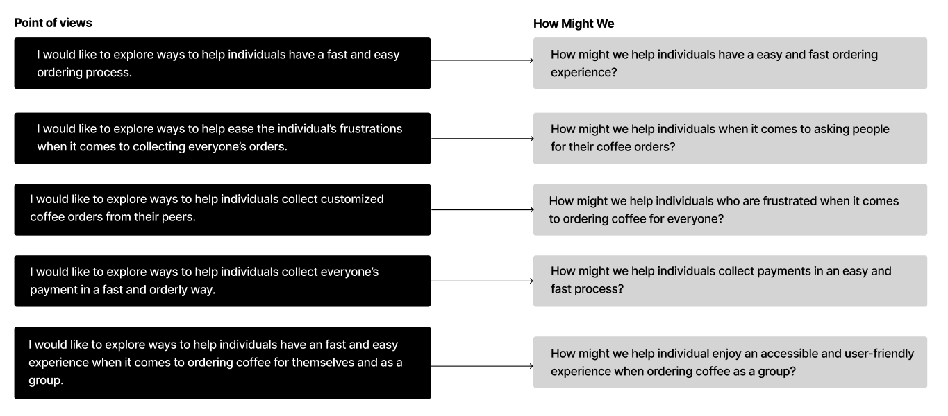
How might we help individuals who are frustrated when it comes to ordering coffee for everyone?
Role: UX/UI Design. Timeframe: 4 weeks
Solution
After conducting user research, a group ordering feature was discovered.
Empathize
Research
Before starting any designs, I must research the demographics and statistics of the United States. This will give me insight into what decision I will make. Based on my findings, these are information I have gathered.
Research Goals
To better understand the challenges users face when collecting their peers' and coworkers' Starbucks orders, our goal is to develop a feature that is efficient, time-saving, and user-friendly. By gaining insights into the specific pain points users encounter, we can create a solution that streamlines the process and ensures a faster and more seamless experience for our users
Research Objectives
1. Understanding what tools help makes group order a seamless and easy process.
2. Identify the users’ needs and pain points when it comes to group ordering.
3. Understand the frustration when reaching out to people and finding them to get their Starbucks order.
Competitive Analysis
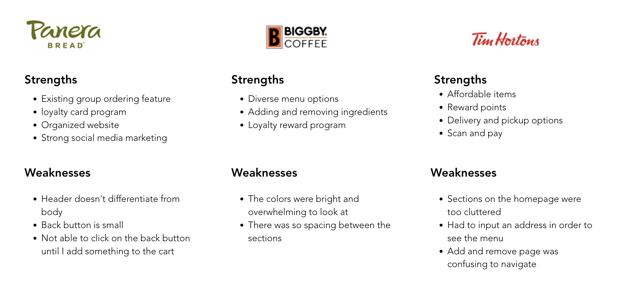
After completing my foundational research, the next step was to identify Starbucks' key competitors. This exploration allowed me to gain insights into both their strengths and weaknesses. The three prominent contenders in Starbucks' competitive landscape were Dunkin' Donuts, Tim Hortons, and Panera Bread. With this information in hand, I proceeded to craft a comprehensive competitive analysis that primarily emphasized their strengths while also acknowledging areas for improvement.
Insights:
All three companies have loyalty programs and menu customizations that are attractive and user-friendly.
While these chains share similarities, they also have distinct features and regional differences in their menus and operations. Additionally, customer preferences and experiences can vary depending on the features of the websites.
Most coffee companies don’t have a group ordering feature on their websites.
User Interviews
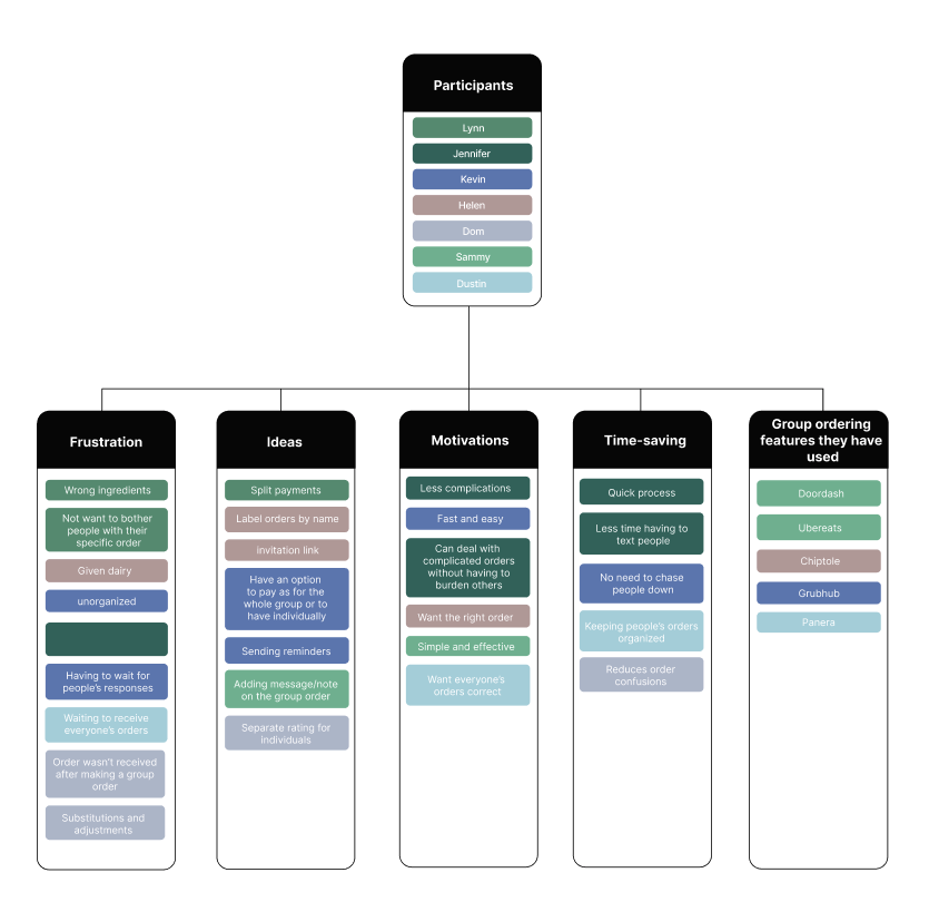
After conducting user interviews, I was able to learn the participants' challenges and frustrations when it came to ordering for a group. Based on the findings, I was able to highlight the common pain points in order to create my affinity map.
Frustration - What are the users’ pain points when it comes to ordering for their families and friends?
Ideas - What do users suggest to add features to the Starbucks website/app?
Motivation - Would users be motivated if a group ordering app is created?
Time-saving - Are users satisfied when ordering for a group of people was less time-consuming?
Group ordering feature they have used - Where did the users use the group ordering feature before and what did they like about it?
Key Findings
Organizing multiple requests from various sources becomes a challenge for users, making it tough to maintain order and clarity in managing everyone's preferences.
The task of collecting payments from different individuals poses difficulties for users, adding to the complexities of group interactions.
The presence of a group ordering feature within Starbucks' services would be greatly appreciated by users, as it could significantly enhance their overall experience and streamline the process.
Define
Affinity Map
Once I made keywords and sentences for my user interviews, I was able to organize and make sense of various information, ideas, and user insights. It was helpful for me to identify these patterns, themes, and insights in order to create the affinity map.
Key Findings
Organizing multiple requests from various sources becomes a challenge for users, making it tough to maintain order and clarity in managing everyone's preferences.
The task of collecting payments from different individuals poses difficulties for users, adding to the complexities of group interactions.
The presence of a group ordering feature within Starbucks' services would be greatly appreciated by users, as it could significantly enhance their overall experience and streamline the process.
User Personas
I embarked on the task of crafting two distinct personas, each embodying the intended user for whom my design choices would be tailored.
Differences between Sammy and Dom
Dom works from home. On a daily basis, Dom doesn't drink coffee. He liked drinking energy drinks. However, Dom does enjoy ordering coffee for everyone during social settings.
Sammy works on-site every weekday. Since Sammy is new to her job, her co-workers would make her go on a coffee run for everyone in the office. Sammy loved coffee and drank coffee on the daily.
POV/HMW
Before I created my POV and HMWs, I want to gather all the necessary information from my research and interviews. By brainstorming and creating ideas by highlighting the users’ pain points and needs.
Develop
Site Map
App Map
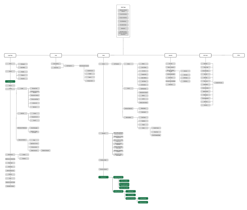
I crafted an intricate site map that has the organization of the Starbucks website, functioning as a cornerstone for the design's architecture. In the process of formulating this site map, my objective was to add a group ordering feature to the sitemap. The goal was that users could effortlessly access information and navigate the website with a sense of fluidity and ease.
Interaction Design
Task Flow
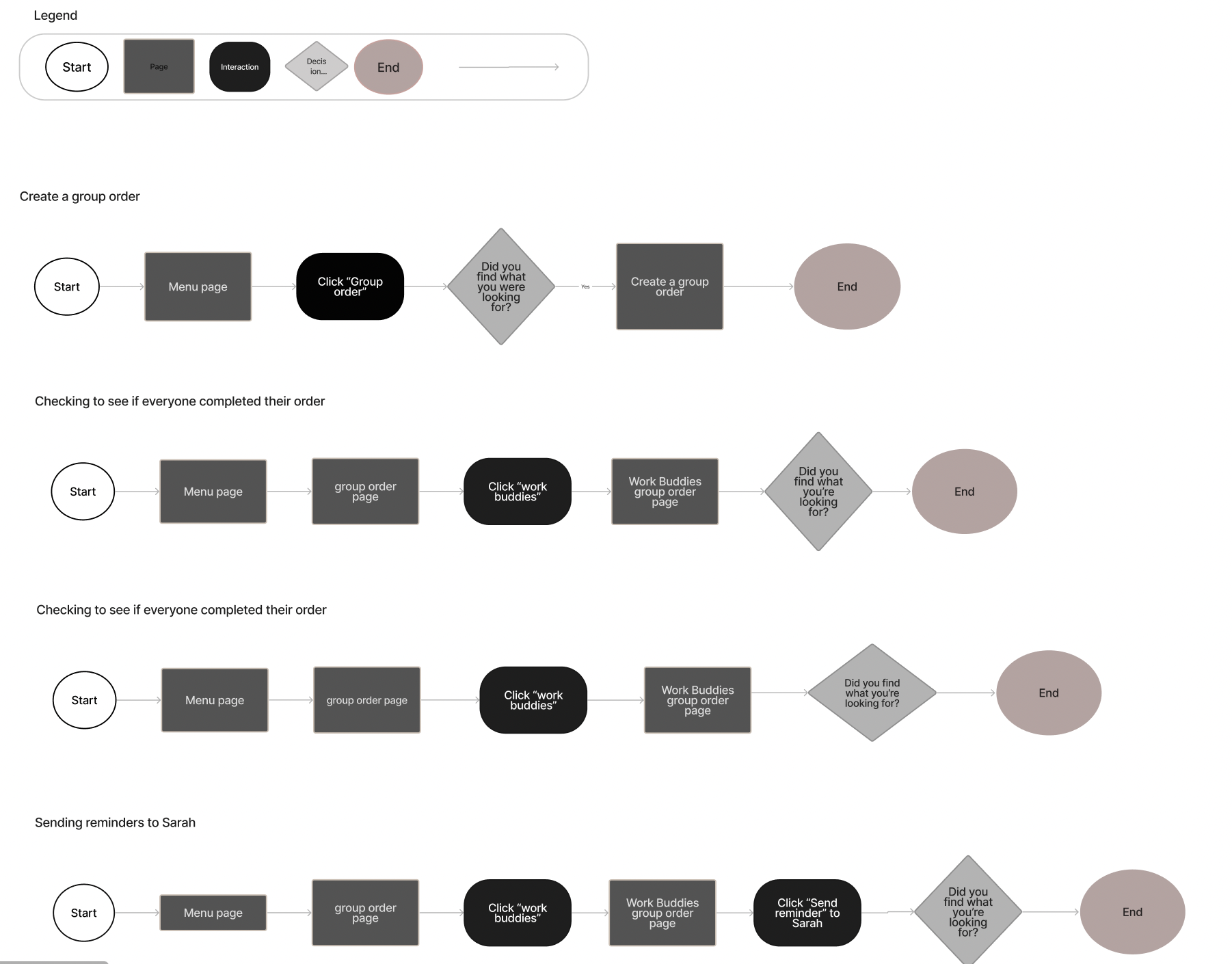
I wanted to visualize the paths I would take to complete a group order. By utilizing the task flow structure, I can gain a better understanding on how to make this feature quick and effective.
Task 1: Create a group order
Task 2: Checking to see if everyone completed their order
Task 3: Sending a reminder to Sarah to complete her order
User Flow
I wanted to create a scenario with my user flow. This flow is brought to life to introduce decisions a user can make on their journey. This allowed me to see the definite and alternative paths.
Low-Fidelity Wireframes
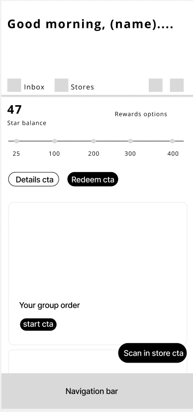
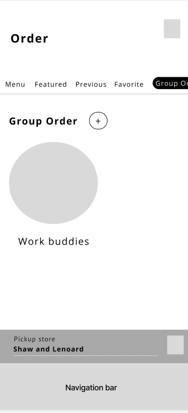
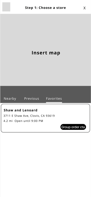
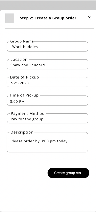
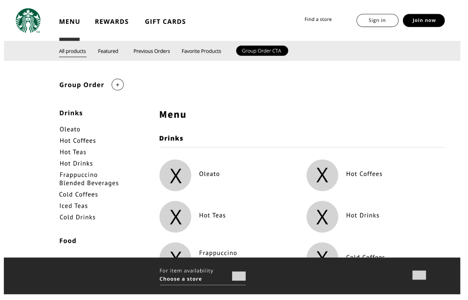
After conducting my research, I began putting my UI design ideas together. By building my design based on the task flows, I was able to highlight hierarchy and use the Starbucks existing layout.
Mobile Wireframes
Desktop Wireframes
After getting feedback from my mentor and classmates, I got a good sense of how my design should look. Some of the mobile screens are the same as the Starbucks app screens. I added a group ordering feature to the screens.
High-Fidelity Wireframes
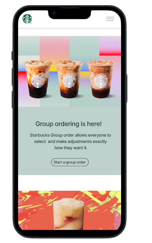
Website on mobile screen
To effectively promote the new feature and ensure it captures attention, I propose featuring it prominently on Starbucks' homepage. Placing the group ordering section at the top of the page will facilitate a seamless and expedited ordering experience for users. This strategic placement not only highlights the convenience of the new feature but also encourages users to explore and utilize it without delay.
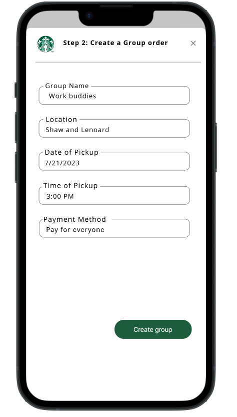
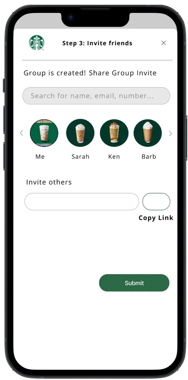
Steps of making a group order
Step 1: Create the group name
Step 2: Invite your friends and family!
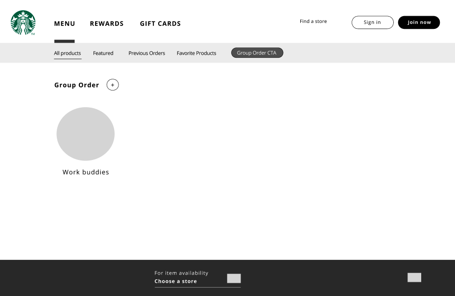
Step 3: When group order is created, it will show up on the tab
Step 4: You can see if everyone completed their order or not. You can also send your peers reminders to select their orders
You can make a group order on your desktop, just by logging into the Starbucks website!
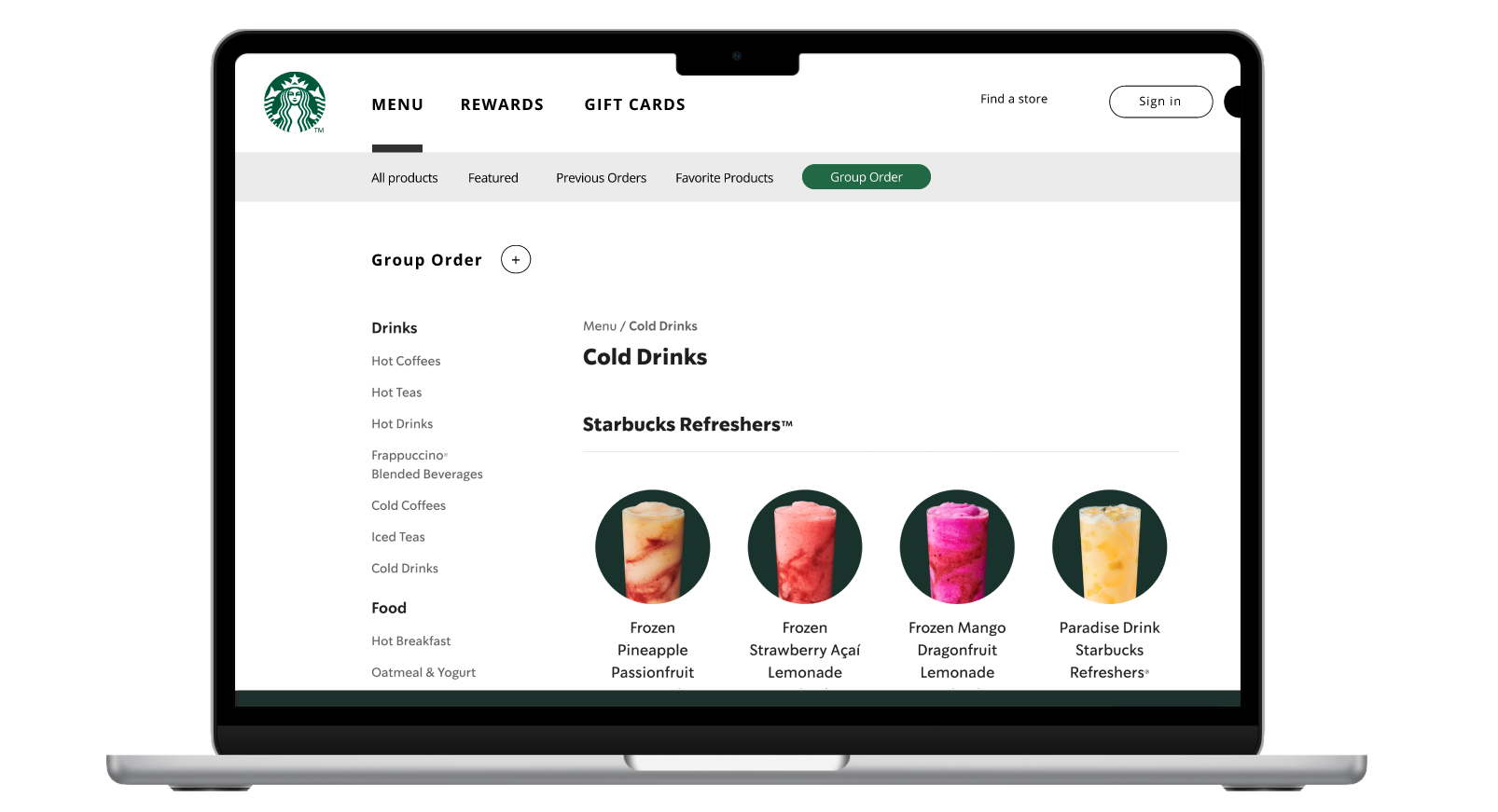
Creating a group order on your desktop
At the forefront of the Starbucks menu page, we've introduced a prominent "Group Ordering" button. This serves as a gateway to a more efficient and enjoyable coffee-ordering experience for groups. With this convenient feature, organizing group coffee runs has never been easier.
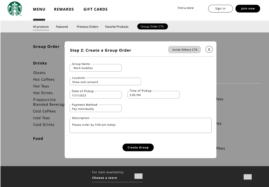
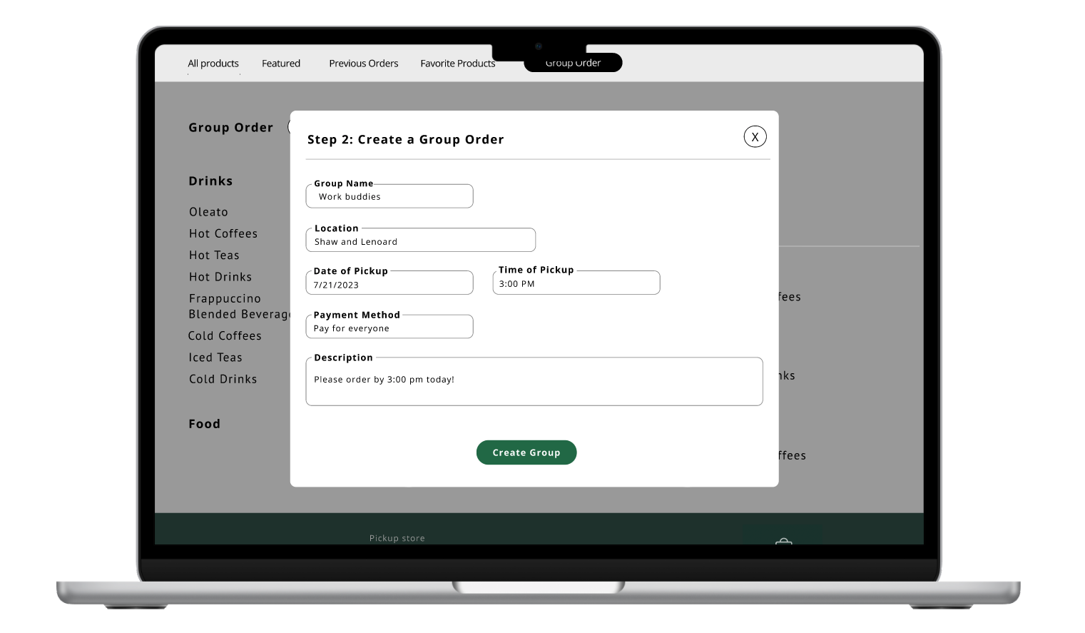
Filling out the group order information
When users click on the "Group Ordering" button, they are empowered to customize their group order with ease. They can specify their group name, pinpoint their preferred location, schedule a convenient pickup date and time, and manage payment methods. This comprehensive set of options ensures that every detail is effortlessly tailored to their preferences and convenience.
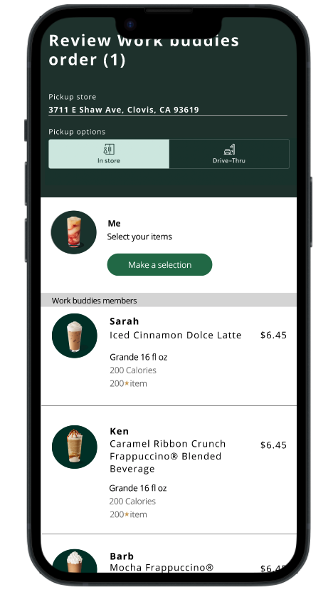
Knowing who completed their orders and who didn’t!
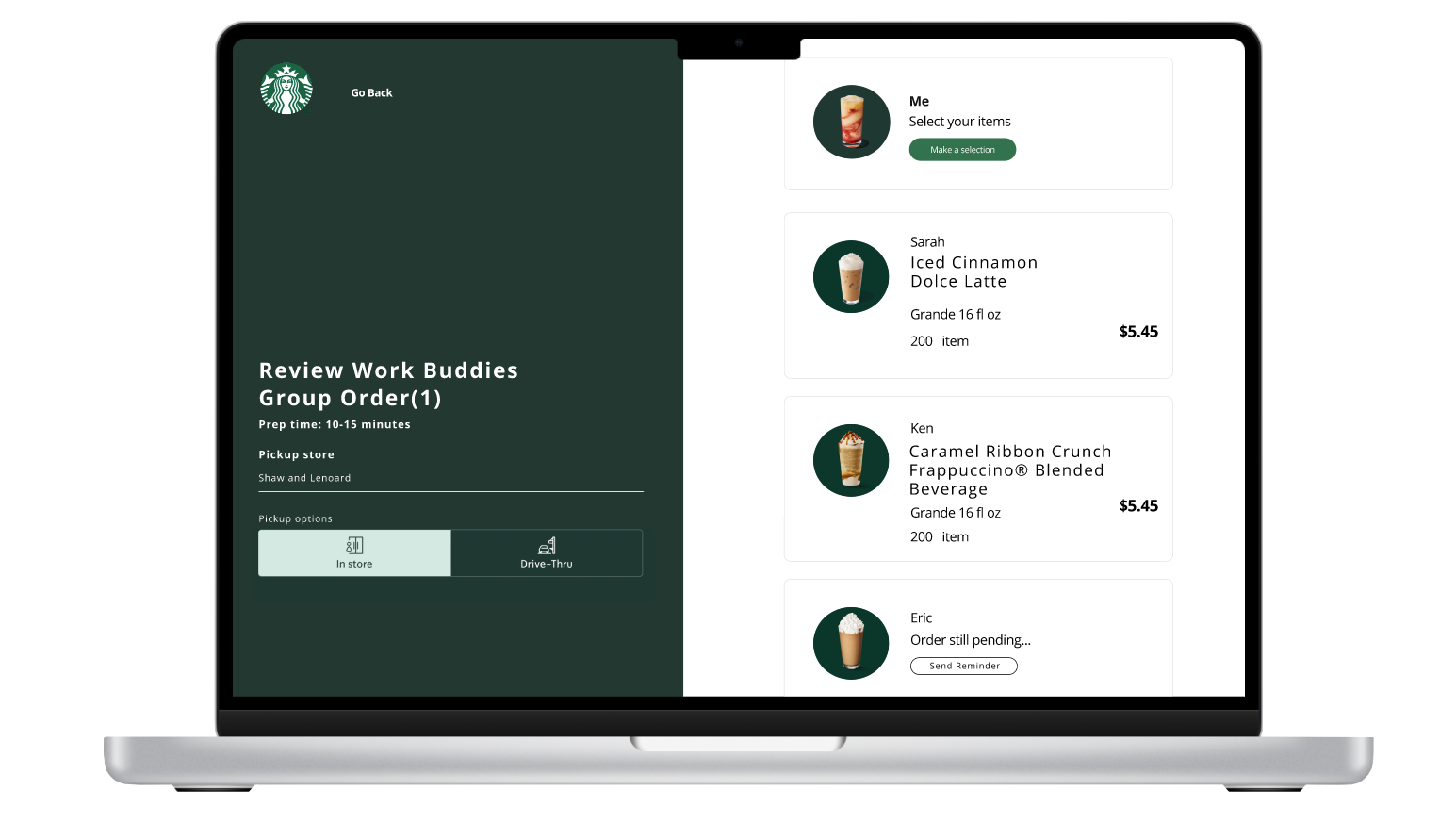
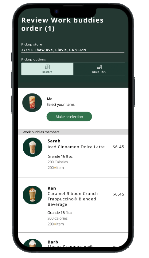
Once the group order selections are made, users can conveniently review and modify their individual orders on the dedicated review page. Furthermore, those who may have missed making their selections, ensure that no one is left out of the caffeine-infused fun. With Starbucks' Group Ordering feature, it's all about providing you with the ultimate control, convenience, and inclusivity in your coffee orders.
Able to make your own selection on the review page
You can not only view everyone else's orders but also customize your own selection on the review page. Ensure that the selection button appears active until you make your choice.
UI Kits
I built this UI kit that serves as a design layout by adding the Starbucks elements and branding.
Brand Style Tile
For the logo, I used the Starbucks original logo that has a mermaid on it.
For the rest of the branding, I centered the typeface, color and photos around the Starbucks brand attributes of high-quality, authentic, and friendly.
Test and Iterate
Prototype Testing
I designed and developed the high-fidelity prototype, which underwent usability testing with a group of four participants. During the testing sessions, I guided each participant through a series of tasks, closely observing their interactions. Although I intended to have them independently read and navigate the prototype, 4 participants had never used Figma before. Therefore, I sat next to them and guided them step by step.
Tasks:
First task: to the first task. I want to make a group order invite. Can you please go through the prototype to make an invite?
Second task: I want you to make sure everyone completes their order. Can you please show me how?
Third Task: I want to send a reminder to Eric to make sure he makes his item selections. Can you please show me how?
Fourth Task: I want to edit my order. Can you please show me how?
The insights gained from these sessions revealed that:
3/4 participants had difficulty navigating through the tasks due to not knowing how to use Figma.
4/4 participants would use the group ordering feature
Final Iterations:
Remove the work buddies page and move it to the review screen.
Before
After
Eliminate this page and move it to the review page instead. This reduces confusion.
Final Prototype
What worked and what didn’t?
Coordinating orders for friends, family, and co-workers can be a hassle, involving running around to gather everyone's preferences. With the introduction of a group ordering feature, this process becomes both swift and effortless for users.
Notably, users have conveyed their frustrations about individuals occasionally forgetting to place their orders, necessitating the sending of reminder texts. To address this issue, I have integrated a "Send Reminder" button on the review page, enabling the group order organizer to prompt everyone to make their selections before it becomes a last-minute concern.
Reflection
First, I have learned numerous skills during this project. It allowed me to walk through the process and learn what design decisions I should make in order to move forward. My favorite part of this project was the user interview portion. This allowed me to finalize my design ideas.
After this project, I have learned:
Time and efficiency are important when it comes to ordering for a group.
Less mistakes - Users repeatedly expressed concerns about how they received their orders wrong.
Easy process - Users want to be able to create a seamless group order.
Next steps
I would like to conduct more tests to make sure the product works and is accessible for users. After conducting more usability testings, the design will be handed off to a developer.


